Friday, August 8, 2014
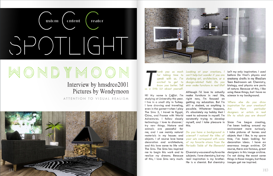
SF Magazine Issue 21
Read it here: http://issuu.com/sf_magazine/docs/sf_magazine_issue_21
Given that the theme of the issue was blockbuster movies, I made an advertisement inspired by the movie, Cabin in the Woods.
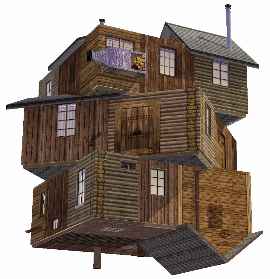
I started out with a twisted three-level cabin elevated in the air (built with no lower levels underneath). I used the constrain floor elevation cheat to create the appearance of the upside-down roof. The cabin was shot in front of a blank backdrop so I could more easily delete the background in Photoshop.
Here is what the cabin looked like after adding a few accents and deleting the background.
Next, I needed trees for the background. Again, I took a picture of trees in front of a blank backdrop so I could more easily delete the background.
I then combined the images of the cabin and the trees, and I adjusted the saturation and contrast to achieve a washed-out appearance like in the inspiration poster.
Using a few special paintbrushes, I added scratches to the image in Photoshop.
And here is the final product!
Here is another advertisement I made featuring the Bellagio Hotel by LarissaMya.
Labels:
Magazine
Subscribe to:
Post Comments (Atom)


No comments:
Post a Comment